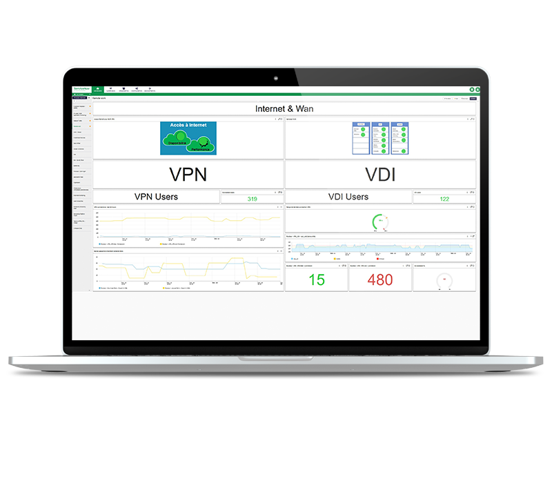
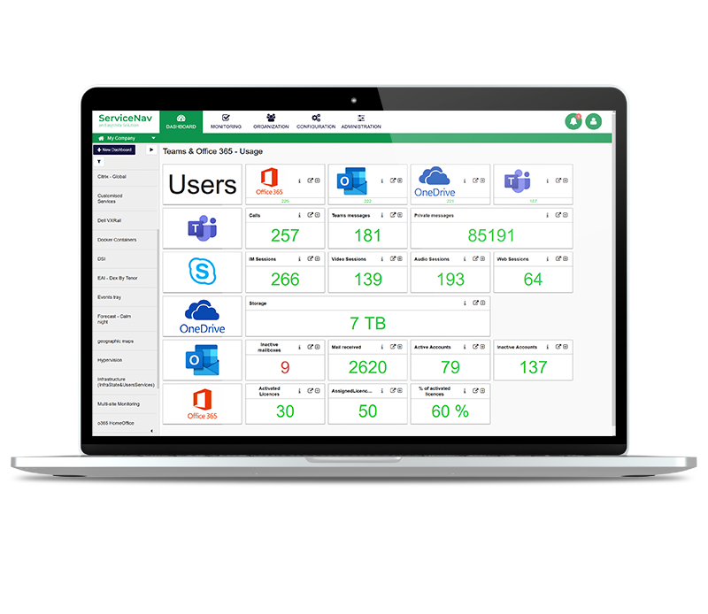
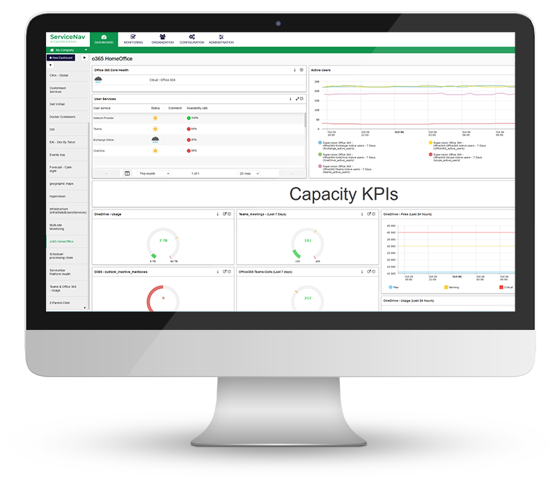
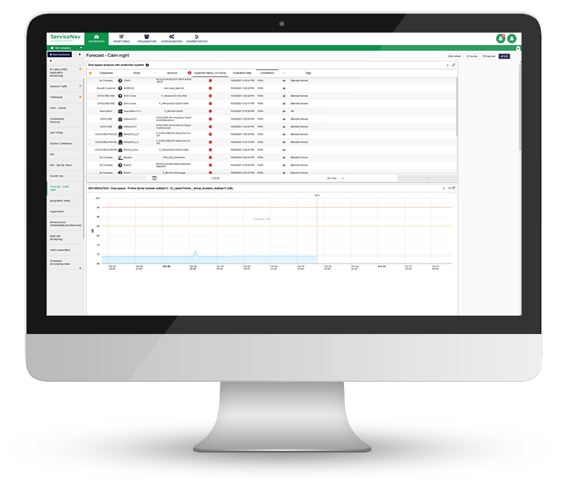
Representing application monitoring
Monitoring applications can pose problems of information, dependencies and alerts readability, when it comes to setting up a "dashboard" type representation.
This can prevent the user from taking the right action at the right time, as they are drowning in unstructured information.
Where to start?
A good application mapping starts with a good structuring of the application components.
A blog article is dedicated to this topic, with the example of a web application.
The widget MAP allows you to make different mappings. It is ideal for mapping an application.
How do I view my application monitoring?
Depending on its nature and complexity, it may be possible to represent :
- Data flows
- Banking applications, B2C (collection)
- High availability requirements (network flows)
- the plug-in Netflow can also be an asset on this aspect
- Application bricks grouped by technology/service rendered
- Databases, web front-ends, webservices
- Facilities and services on a map
- Hospital, Datacenter, Factory, in order to locate quickly and physically the problematic elements
- Metrics
- Technical data: ping, CPU/RAM load, disk space
- Business data: temperature, turnover per box, etc.
Try 30 days free
How can we make it even clearer?
The addition of images and shapes will help structure the data presented.
The use of user servicesto have a minimum of elements on the screen.
For example, we can define a user service for the databases, and another one for the infrastructure that carries the application. These two services make up another service, which is named after the application.
Depending on the needs and the number of applications to be supervised, we will choose to represent one service per application, or to go into more detail.
Some examples
Here are some examples of application mapping, carried out in ServiceNav